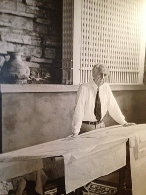
Upon learning from my high school guidance counselor that I should study architecture, I immediately went to the Gadsden (Alabama) Public Library to see what architecture was. At age 16, I had never really thought about it as a career. There were only three books in the stacks under this subject—one on Thomas Jefferson, and two on Frank Lloyd Wright. Thus began my long love affair with these two American geniuses.I was immediately enamored with Wright’s drawing style, and in my first year of study at Auburn University I began to copy his colored pencil techniques for my presentations. I simply could not get enough, which led me to a parallel appreciation of Japanese woodblock prints, which informed Wright’s drawings with a great and wonderful result.
His drawings were lush and intricately detailed, showing people, furnishings, art, cars, clouds, trees and occasionally a flock of birds on the wing encircling one of his towering spires. They evoked emotion, and many looked for all the world like finished buildings, not just colored pencil conceptual drawings (see Fallingwater and countless others).
His drawings put the viewer there, into the building, or just outside at the perfect vantage point to take in the full breadth of his design, its relationship to the site and environs.
Upon reading about the current show at MoMA, “Frank Lloyd Wright: Density vs. Dispersal,” I was naturally intrigued. The show’s title may sound a bit academic, but the content of the show, carefully selected from the recent joint acquisition of the architect’s archive of drawings by MoMA and Columbia University’s Avery Architectural and Fine Arts Library, does not disappoint. If anything, it broadens one’s view of Wright and his keen vision of what a tall building could and should be.
It is well known that once Wright got on an idea, he would not let go of it until he had built a version of that vision. The Guggenheim Museum is one such example, as Mr. Wright had investigated the spiral form numerous times over the decades of his long career, only to see it realized at the very end of his life.
Such also is the case with his tall buildings, where early on he envisioned the building as a tree and the trunk its central spine, with floor planes extending out, branch-like, and cantilevered to extreme lengths, tapering as they went to the thinnest of dimensions.
Onto this structural frame, Wright proposed hanging or wrapping a mosaic of glass panels, which were referred to by Wright as “shimmering fabrics—woven of rich glass—glass all clear or part opaque and part clear—patterned in color or stamped to form the metal tracery that is to hold it all together, to be in itself a thing of delicate beauty.”
He also had quite a way with words.
The exhibition covers 10 building projects, including the two built works in the show, The Harold C. Price Company Tower in Bartlesville, Oklahoma, of 1956, and the S.C. Johnson & Son Research Tower in Racine, Wisconsin, of 1939, plus his “Broadacre City” concept model for dispersing the American dream into the countryside.
The project that steals the show, however, is his St. Marks-in-the-Bouwerie Towers (1927-31). I have long known about this early work but had no idea how marvelous a design it was, or how critical it was to the development of his skyscraper mentality.
The towers are, in a word, luxurious, with an exterior skin made up of thousands of glass panels set in copper frames forming a faceted and ever-changing facade, all wrapping around a pinwheel-shaped floor slab cantilevered from a central core.
The interior layout of duplex apartments spiraling around this core are replete with classic Wrightian touches of whimsy and utility, including a most intriguing bath layout, angled staircases, hexagonal elevators, and a bedroom mezzanine balcony above a double-height living room.
The drawings include furnishings, art, carpets and everything down to tablecloths, all in a three-dimensional section perspective drawing that puts any current 3-D computer program to shame. The beauty of these drawings is found in the line weights and precision to which they are executed. Not a single erasure mark could be found—and the details are extraordinary.
Hallmarks of this design can be found in both the Oklahoma and Wisconsin towers built decades later, including the sharing of double-height vertical interior space through a cantilevered balcony from a central core, inventive exterior glazing, and, in the case of the Price Tower, a pinwheel plan layout clearly referencing the St. Marks concept.
A full sheet of structural details for the Price Tower is included in the show, and its delicacy belies the strength and utility of the drawing. Even the viewer unaccustomed to such a technical drawing will be impressed by the precision to which his staff executed Wright’s often radical and groundbreaking visions.
The exhibition culminates with two drawings of Wright’s most ambitious project, The Mile High Office Tower. “The Illinois,” from 1956. These astounding drawings measure just under 8 feet in height and represent his final vision of a “tall” building.
This show gives new meaning to the maxim that “for all we talk of architecture in terms of theory, it’s ultimately an art of composition, and when there is no subtlety or grace to the composition, to the proportions, to the mix of colors and materials and textures, then a building fails as an aesthetic object.” There are nothing but successes shown here.
The exhibition closes on Sunday, June 1—so, like most of Frank Lloyd Wright’s oeuvre, it’s worth a pilgrimage to see.