


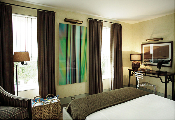
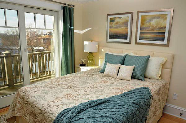
Emerald before its time, as seen in this bedroom featuring multiple shades of green designed by Kerry Delrose in the Hampton Designer Showhouse two years ago. COURTESY KERRY DELROSE
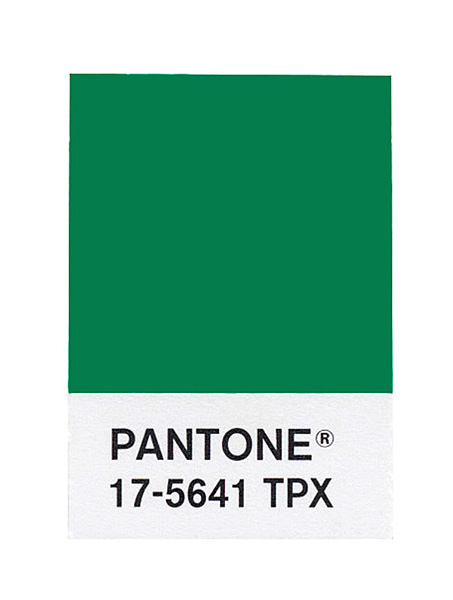
Pantone declared Emerald its 2013 color of the year. COURTESY PANTONE
Pantone declared Emerald its 2013 color of the year. COURTESY PANTONE
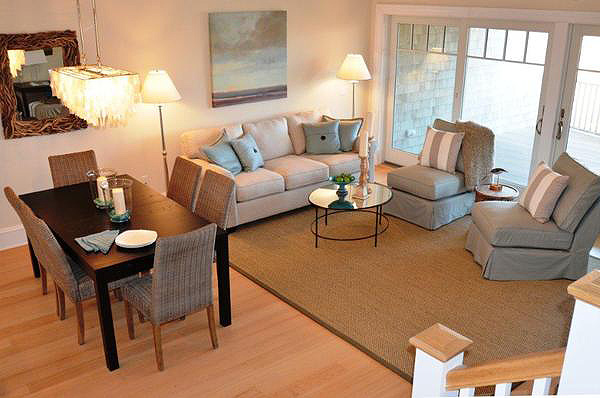
Allegra Dioguardi uses Aloe as an accent inside this East End home. MARY THAMES LOUIS
Allegra Dioguardi uses Aloe as an accent inside this East End home. MARY THAMES LOUIS
Allegra Dioguardi uses Aloe as an accent inside this East End home. MARY THAMES LOUIS
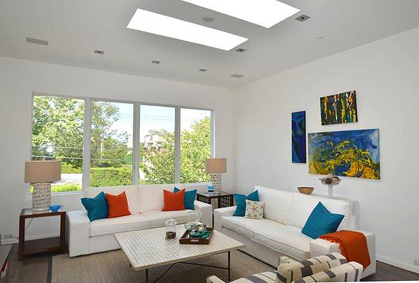
Though Emerald is Pantone's 2013 Color of the Year, turquoise or last year's tangerine may be more appropriate for the East End, as in this living room designed by Allegra Dioguardi. MARY THAMES LOUIS
Emerald before its time, as seen in this bedroom featuring multiple shades of green designed by Kerry Delrose in the Hampton Designer Showhouse two years ago. COURTESY KERRY DELROSE
New year, new beginnings, new color.
Following the 2012 reign of trendy Tangerine Tango, a spirited reddish orange seen everywhere from fashion to furniture after color authority Pantone declared it last year’s Color of the Year, now it’s time to cool off.
2013 is all about Emerald.The rich, vivid green has some East End interior designers fawning while others are left scratching their heads after Pantone Executive Director Leatrice Eiseman named it 2013 Color of the Year last month.
The final decision was made by thoughtfully evaluating today’s world, from its social and environmental issues to the entertainment industry and art, Ms. Eiseman explained in an email last week. Emerald had no competition, she said.
“We felt very confident about this choice,” Ms. Eiseman said. “Emerald was chosen for 2013 because it is the color of balance and harmony, enhancing one’s
sense of well-being and inspiring insight and clarity, which is so important in today’s complex world. Emerald is a lively, radiant and lush green. Because of its association with much desired jewels, the perception of Emerald is sophisticated and luxurious. As it has throughout history, multifaceted Emerald continues to sparkle and fascinate.”
But some local interior designers are doubtful. Jennifer Mabley and Austin Handler of Water Mill-based Mabley Handler Interior Design remain wary of the trend and its role on the East End, they say.
“Emerald Green has its place, but we wouldn’t design an ethereal beach house around that color,” Ms. Mabley wrote in an email last week. “However, we can appreciate its distinct and iconic presence in ‘The Wizard of Oz,’ or perhaps in a splashy Palm Beach palace. For an old-school Hamptons look, try Kelly Green instead of Emerald Green.”
Color is a very personal expression, East Hampton- and Manhattan-based interior designer Jeffrey Parker explained in an email last week. He pushes his clients to trust their instincts while selecting a color palette for their homes. Typically, the colors they intuitively gravitate toward will make them most comfortable for an extended period of time.
“Your home environment should be a reflection of your personality and style, not necessarily a reflection of a marketing trend,” he said. “I would not encourage a client to ever select colors because they were the color of the moment. Buying an Emerald Green sweater is far easier to put away when you’ve tired of it than an Emerald Green sectional sofa! I leave color-of-the-moment trends to fashion.”
Tangerine Tango made a huge splash on the runway last year, from accessories and dresses to nail polish and makeup. The fact of the matter is that Pantone’s choice does have an impact, according to Allegra Dioguardi, an interior designer who owns Styled and Sold Home Staging in Westhampton Beach. So get used to green, she said.
“I have not used Emerald in my designs yet, but I suspect I will,” Ms. Dioguardi wrote in an email last week. “It can’t be helped. We will all start seeing Emerald featured by the retailers and resources used by the design trade. Even if you don’t typically like the color, it tends to grow on you just because of the exposure.”
Pantone’s choice is good in Kerry Delrose’s book. The East Hampton resident, who heads up the Delrose Design Group in Manhattan, is a self-admitted Emerald fan. Though he hasn’t seen the hue trending yet, he said he’s curious to see if his clients will come in requesting it.
“Personally, I like Emerald quite a bit,” he said, though he noted that a little of that hue goes a long way. “It does not impact our designs, as we always scheme out what is most appropriate for the client and the space and for the long run. Unlike clothing, which changes year to year, people do not redo their homes each year, so the design has to be good. And not trendy.”
The key is to simply err on the side of caution, Ms. Dioguardi said. Be careful. Emerald is a strong color and can appear dark on walls or large furniture pieces. Use it as an accent color on toss pillows, stemware, malachite boxes and accessories, coupled with complementary colors, she said, which include white tones, black and aged brass—the new trend in metal finishes—as well as turquoise and teal to soften it, giving Emerald a more watery feel.
“I think Emerald is going to be tricky to use,” she said. “It is so personal and I predict that in regard to interiors, it will trend out quickly.”
Not to be outdone, paint giants Benjamin Moore and Sherwin-Williams also recently announced their colors for 2013: Lemon Sorbet and Aloe, respectively. Mr. Delrose and Ms. Dioguardi are in favor of Sherwin-William’s choice, but both are having a hard time swallowing Lemon Sorbet.
“I love Benjamin Moore, but I was disappointed in their choice of Lemon Sorbet,” Ms. Dioguardi said. “Sorbet is a color on the fence. It can’t make up its mind whether it is a neutral or trying to make a statement. I’ve heard it described as ‘sunny,’ yet I find it just a bit timid and just a touch too blue-based. Blue-based yellows are known to be anxiety-provoking. I tend to gravitate toward more of a straw or sisal yellow.”
Mr. Delrose tries to stay away from yellows altogether, he said.
“Benjamin Moore’s choice of Lemon Sorbet is a tough one for me,” he said. “Yellow is such a hard color to work with, in my opinion. You either tend to base a whole room around it or not at all.”
In the Hamptons, Mr. Delrose utilizes soft beachy shades, he reported, mostly greys and blues.
Ms. Dioguardi said that she likes beach glass colors and serene shades. Trendy colors do surface in her designs as accents—including from years past.
Updating and reinvention are key when it comes to interior design, Ms. Eiseman said.
“The fun part is taking that which you already own and using it with something new,” she said of past Colors of the Year. “Think of Tangerine and Emerald in a fun summer print, place mats on the patio table, an exotic paisley print. A color doesn’t disappear after their one-year range.”


 Michelle Trauring on Jan 11, 2013