


While in Rome.
While in Rome.
While in Rome.
While in Rome.
While in Rome.
While in Rome.

Since missing the opening of the Rosenthal Center for Contemporary Art in Cincinnati in 2003, I have long anticipated visiting a building designed by Zaha Hadid.
On a recent trip to Rome my goal was realized by visiting her Museo Nazionale Delle Arti, also known as “MAXXI.”
The museum opened last year to great acclaim. To suggest that it was near the top of my list (after the refurbished Sistine Chapel, the Pantheon and Borromini’s St. Ivo Chapel) would be an understatement.
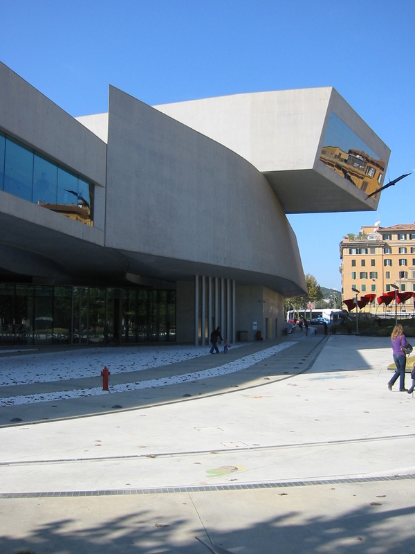
Rome does not wear new architecture well, as evidenced by Richard Meier’s recent Modernist Envelope on the banks of the Tiber (the bane of all Romans), which is why putting the MAXXI a 15-minute taxi ride from the Vatican is key to its grudging local acceptance. Out of sight, out of mind is the best face one can put on it.
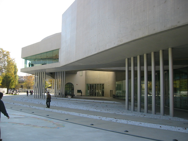
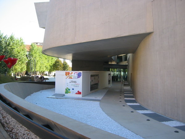
Upon arrival, given the neighborhood of family run flower and food markets, I was curious as to why the tall woven metal fence and motorized gates surrounding the entire structure were necessary. More on that later. The building’s form, for lack of a better word, is hulking. And the ultimate question for any first time visitor of “where is the entrance” went unanswered.
None of the typical architectural devices seemed to apply here, even those of a circuitous nature informed by either Frank Lloyd Wright or Ms. Hadid’s mentor, Frank Gehry.
Looking for the entrance proved perilous as well, as I stumbled not once but four times in short order—first over a low curb, which became a long swooping bench, then over lighting embedded (not quite enough) in the concrete walkway, next over the metal edging between the walkway surface and adjacent gravel beds or shallow water pools—all while searching for some clue for the entrance. Not exactly Michelangelo’s welcoming Campidoglio courtyard.
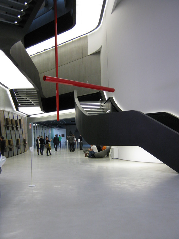
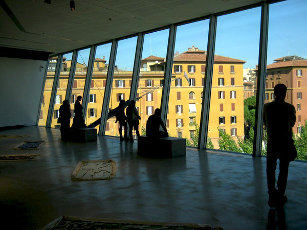
Once eventually found, the entrance reception hall burst into a three-story-high bowl of squid ink tagliatelle strands rising to a sky-lit roof. The black tagliatelle were in fact staircases layered upon each other and illuminated underneath to further enhance their floating effect. The only problem is that once ascended they really led nowhere.
The most significant gallery (the museum is almost devoid of art) on the uppermost floor, which forms a large cantilevered mass of sloping glass on the exterior, was a gallery with a sloping floor on which panels of fabric were displayed. Here, the few assembled visitors were seen looking out of the floor-to-ceiling windows at the adjoining neighborhood of low-rise apartment houses and tree-lined streets, not at the art.
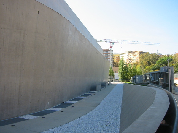
If, as Mies van der Rohe mandated, “God is in the details”, no deity was at work here. The towering concrete walls of the exterior—which constitute about 90 percent of the building—were well formed, but there was so much of them as to deaden the senses. The walls just droned on and on with an occasional stainless steel door punched through.
The glazing, what little there was of it, lacked any sense of delicacy or scale, which, when juxtaposed against all the concrete would have been helpful. It was almost impossible to tell which glass panel was a window and which was a door, which made entering and exiting all the more confusing.
As to the interior, and the aforementioned stair atrium, I am a big fan of black surfaces as architectural elements. Ms. Hadid has used black effectively in her other work, at least in photos.
It should also be noted that this space photographs magically, however, the use of black in architecture comes with many caveats, particularly when used with a sheen or semigloss finish. It shows everything: dust, nicks, poorly executed joints, or ripples in the surface. Black can become an Achilles’ heel if not well wrought.
The further misuse of materials on this towering interior element came in the selection of a very tightly spaced metal grating material for the stair and walkway surfaces, which created a moiré pattern when walking across them. One seemed to be walking on an ever-moving, not static, surface. It was most unsettling three stories high in the air.
I suppose this narrow gauge material was selected to keep debris from falling through the walking surface to the lighting housings below but after less than a year of minimal use, this space is full of everything that might be imagined in such a building in an urban setting. Not a pretty sight. And a maintenance nightmare.
Tadao Ando, Ms. Hadid is not, and perhaps prefers not to be. However, the gush of praise on Ms. Hadid and her work certainly makes one stop to consider that the Empress has no clothes, or at a minimum needs a new couturier—a team perhaps, to take the forms generated by concept and computer and ensure that in three dimensions they become more than a photo-op for fashion magazines.
Computer generated architectural design has given way to buildings such as this, and many others around the globe, being praised, photographed and lauded. But it strikes me as a bit like the ubiquitous laugh tracks on countless prime-time television sitcoms, where the laughing is there to tell one that it’s funny. Because how else would one know?
Without those laugh tracks, one might actually consider the show to be boorish and mundane; a waste of time. Such has become the case with much of architecture today. We are told that it is wonderful and amazing and when we see it we think that it must be.
There are certainly amazing buildings being designed today with new computer 3-D technology but this is not one of them. I hope a more complete and better executed version of Ms. Hadid’s vision will be found in her Aquatic Centre at next year’s 2012 London Olympics.
Meanwhile, back at the woven metal fence—upon departing, I discovered its genesis while walking to a nearby taxi stand. On some neighborhood buildings, there was a long wall of graffiti reminiscent of New York City subway cars in the 1970s and ’80s. Clearly the fence and motorized gates were meant as a deterrent to the possible defacing of the sweeping concrete edifice. But in reality, it was just what this hulking mass of concrete needed—some humanity, and possibly an arrow pointing toward the entrance.
Next time, Proportion Reconsidered.
More Posts from 


